 THE UNIVERSITY OF CHICAGO


Health Data Visualization Contest Winners
PUBLISHED ON OCT 22, 2018
In the first Health Data Visualization Contest sponsored by the Health and Medical Geography Specialty Group (HMGSG), the American Hospital Association, and the Center for Spatial Data Science, we encouraged students, faculty, and other members to translate their research into meaningful and modern ways that can impact mainstream health thought. Judges include representatives from academic, private, and public health sectors. Winners were announced at the HMGSG business meeting at the American Association of Geographers conference earlier in 2018. We had a stellar response, and truly engaging winners!
In the following overviews of our top two winners, authors of the project describe their goals and motivations.
Winning Submission
Visualizing Preterm Birth in Fresno County, CA
MARTA JANKOWSKA, JAY YANG, JESSICA BLOCK
The Preterm Birth Initiative (https://pretermbirth.ucsf.edu/about-ptbi) is a multi-year interdisciplinary research effort with participants from multiple universities from around the world with the goal of reducing the burden of preterm birth. The Initiative is funded by Marc and Lynne Benioff and the Bill and Melinda Gates Foundation with research arms in both the United States (primarily California) and Africa (primarily East Africa). A primary location of focus for PTBI is in Fresno, CA (http://www.ptbifresno.org/) where a Collective has formed made up of multiple community members, non-profits, county and local government representatives, hospital and medical care representatives, and researchers. The common goal is to reduce the burden of preterm birth in Fresno County, which has one of the highest rates of preterm birth in the United States.
As a part of this Collective, our research team from UCSD has been working toward developing and deploying an online data visualization tool that can aid in the assessment, exploration, and discovery of patterns in preterm birth and other social, environmental, and hazard-based factors. The online tool has two sides - a more user-friendly 'front' end with simple clicks and view options for a number of preterm birth related topics like health care, environmental hazards, and demographics. There is a 'back' end with much more data and is intended for more advanced users to be able to thoroughly explore the preterm birth related data. The back end includes hundreds of variables from the census, EPA, state and county governments, law enforcement, and satellite imagery derived data. The front end is designed in the Bootstrap framework with various interactive visualization modules using D3 and Leaflet packages, while the back end employs a tighter connection between the data exploration platform and the PostgreSQL database within the Node.js environment. The two applications are designed differently to provide their targeted audiences with the data visualization and further analytics that support knowledge discovery from preterm birth data.
In developing the tool we have met multiple times with partners from the Fresno group in order to obtain feedback about data to include in the tool, usability, and design. This back and forth with the community and non-profit members has proven fruitful to ensure that the tool is designed in a way that is welcoming to the public. In fact, it is why we ended up with a 'front' page that would be more accessible and easy for members of the public to use. We will also be working on a set of videos to go with the tool to explain how to use the front and back ends including providing some use cases. In particular, we hope to see the tool being used by non-profit organizations who are applying for grants and could use data visualizations or simple maps for their applications. Another use case may be for researchers looking to explore data in more depth in terms of spatial patterns and occurrences.
View at: https://delphidata.ucsd.edu/ptbi/ui/home/
Data Source: California Office of Statewide Health Planning and Development (OSHPD); US Census; CalEnviroScreen
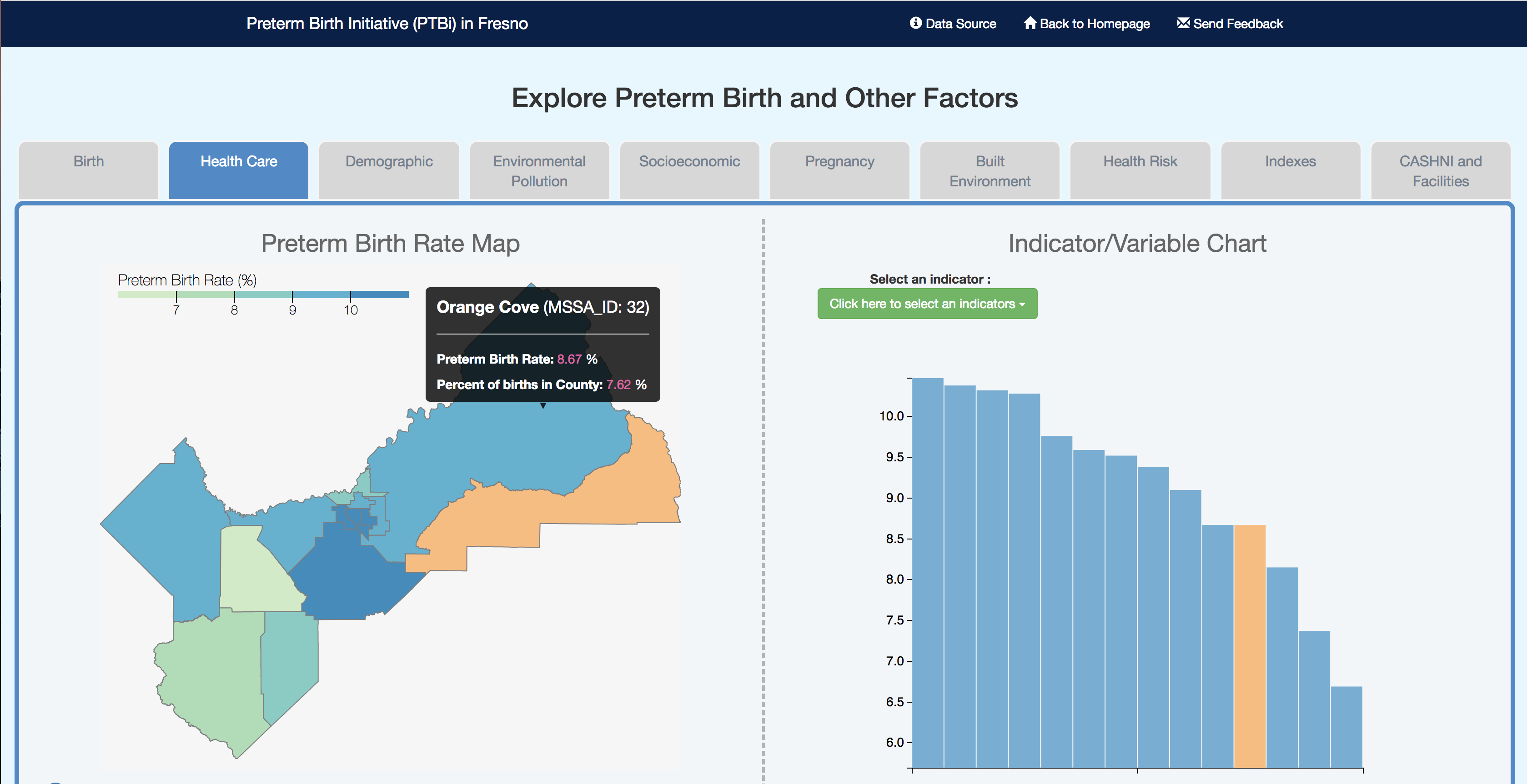
Interactive maps and charts of multiple indicators of health are linked to facilitate exploration and insight in this dynamic web mapping application.
First Runner-Up
Smoking Mapped
CASEY KALMAN, MEGHAN KELLY
This atlas is a visual exploration of the relationship between smoking rates throughout the US and various demographic groups. It is well known among the public health community that smoking rates are higher among certain demographics. This is due in part to advertising and campaigns carried out by tobacco companies that target specific groups. This atlas shows that those counties with higher populations of these demographic groups most often are also characterized by higher smoking rates.
The maps from the atlas were created in QGIS, stylized in Adobe Illustrator, and the final layout and design of the atlas as a whole was carried out in Adobe InDesign. The design of the layout was inspired by the maps themselves as I used an enlarged version of the bivariate choropleth legend for the front and back cover. The bivariate theme was then echoed on each page through the use of overlapping header and side bars.
The subject of the atlas was inspired by a personal interest in the geography of population level health. Through volunteer advocacy work with my local public health department and other organizations, I had become informed about the various tactics being used by big tobacco companies to target vulnerable and minority groups. I wanted to see if there was a visual relationship between these demographics and rates of smoking. I see this as a preliminary exploration for future projects related to tobacco use and demographic, socioeconomic, and environmental variation.
View: Final Atlas
Data Source: Multiple, listed on final page of atlas.
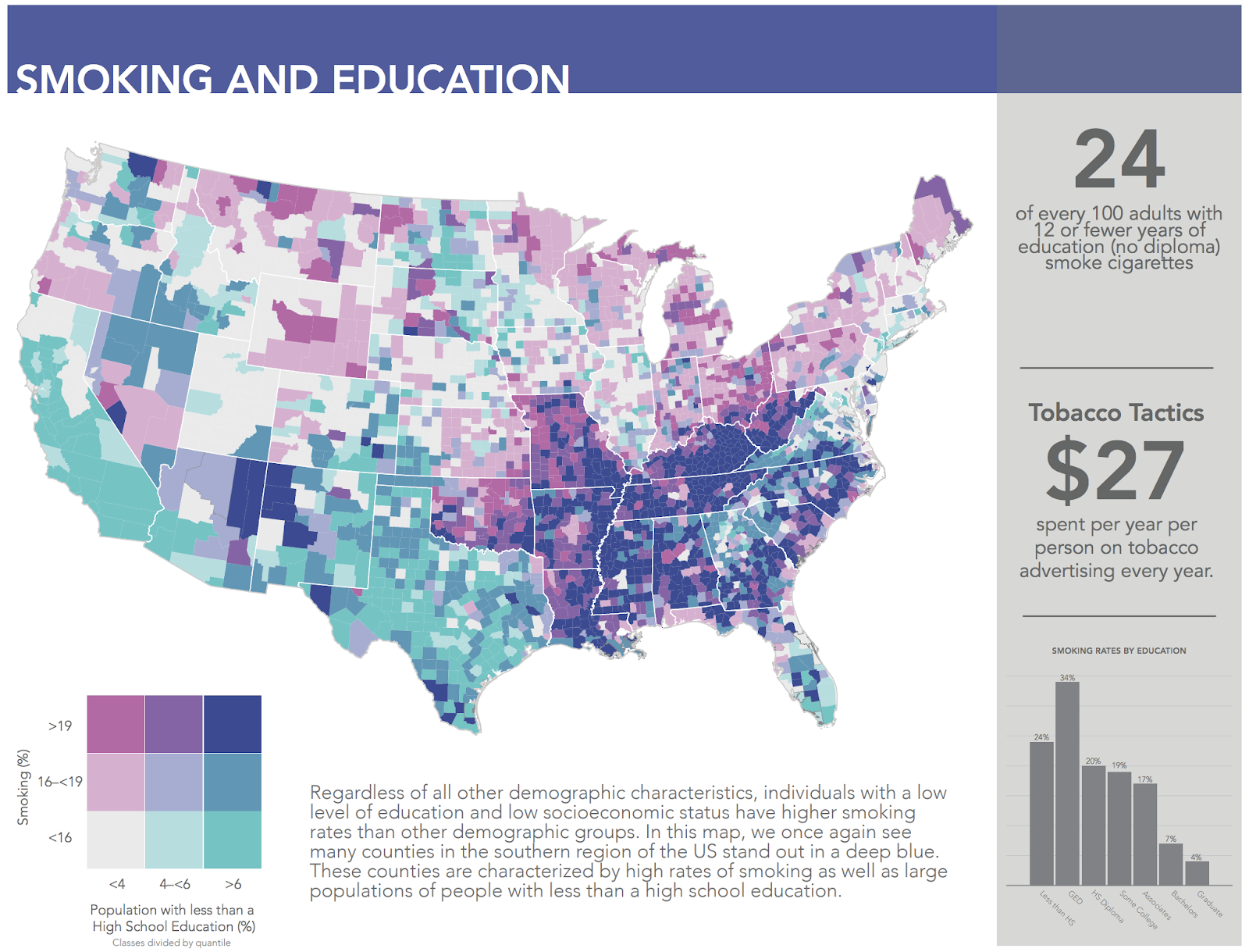
Richly colored choropleth maps are paired with infographics of key statistics and insights throughout this elegant atlas.